Installation
Add to Your Project
Section titled “Add to Your Project”-
Install the
unplugin-gueletonpackageTerminal window npm install unplugin-gueleton@latestTerminal window pnpm add unplugin-gueleton@latestTerminal window yarn add unplugin-gueleton@latest -
Add
unplugin-gueletonas a plugin to your build tool configuration -
Register Gueleton components in your application
-
Start the development server
-
Finally, you need to understand some Gueleton specific concepts.
Skeleton placeholders are generally composed of a light background with one or more dark blocks.
containerboneboneboneGueleton calls the light background
container, and the dark blocksbone.When customizing skeleton placeholder styles, you’ll use them to define the background and skeleton block styles respectively.
That’s it! Now you’ve successfully installed Gueleton and can start using it to add skeleton placeholders to your application.
Options
Section titled “Options”You can customize global Gueleton behavior by passing options to the plugin.
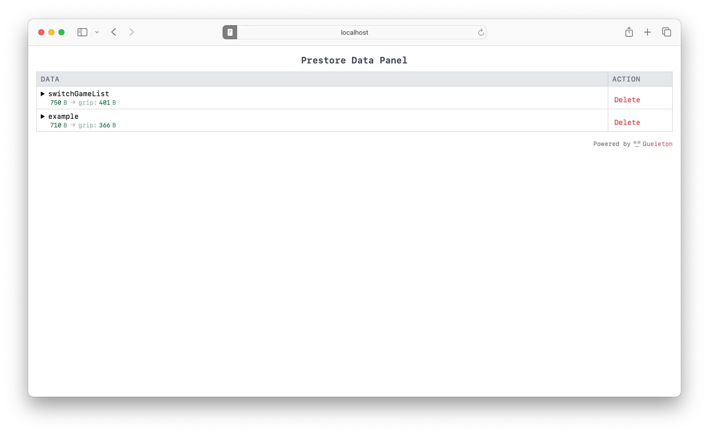
Use the limit option to set cropping rules for pre-stored data. It can be a number or an object.
-
When
limitis a number, it represents taking the firstlimititems, only valid for arrays. -
When
limitis an object,lengthrepresents taking the firstlengthitems,propertiesrepresents cropping object properties, only valid for objects. -
Default value:
3
Use the fuzzy option to adjust how Gueleton determines which DOM elements are recognized as bone.
Lower fuzzy values generate more, finer-grained skeleton blocks, while higher values generate fewer, larger blocks. This is also key to how Gueleton automatically adapts to different UI component libraries.
- Default value:
1 - Examples:
-
When
fuzzyis set to1,p1andspan1are recognized asbonerespectively.<div class="div1"><p class="p1">This is a paragraph.</p><p class="p2"><span class="span1">Inline element</span></p></div> -
When
fuzzyis set to2, the entirediv1will be recognized as onebone.<div class="div1"><p class="p1">This is a paragraph.</p><p class="p2"><span class="span1">Inline element</span></p></div>
-
Use the type option to set how skeletons are rendered.
- Options:
overlay(default): The entire skeleton placeholder will overlay the actual content.inPlace:bonewill overlay its parent element.
bone and container
Section titled “bone and container”Use bone and container options to customize bone and container styles respectively.
Both can accept a style object and className string.
- Default value:
{style: {backgroundColor: 'rgba(240, 240, 240, 1)',},className: '',}
container
Section titled “container”- Default value:
{style: {cursor: 'wait',backgroundColor: 'rgba(255, 255, 255, 1)',},className: '',leave: {}}
container.leave
Section titled “container.leave”When data loading is complete, Gueleton removes the skeleton placeholder and displays the actual content. The container.leave option allows you to define leaving styles for the container element.
Combined with the transition property, it can achieve smoother transition effects.
The transition animation example shows how to implement skeleton fade-out effects by modifying leave styles.
- Default value:
{style: {},className: '',}